FullStack Labs

Please Upgrade Your Browser.

Unfortunately, Internet Explorer is an outdated browser and we do not currently support it. To have the best browsing experience, please upgrade to Microsoft Edge, Google Chrome or Safari.
Upgrade
Welcome to FullStack Labs. We use cookies to enable better features on our website. Cookies help us tailor content to your interests and locations and provide many other benefits of the site. For more information, please see our Cookies Policy and Privacy Policy.

Creating an SVG Gauge Component from Scratch

Written by 
,
Creating an SVG Gauge Component from Scratch
blog post background
Recent Posts
Six Ways to Handle Concurrency in the JVM
Is there value in learning Vanilla JavaScript?
How to be efficient in remote design work in multicultural teams

Although there are a plethora of plugins that make prototyping apps a breeze, sometimes you need more customization, less bloat, or more reliable third-party libraries. Luckily, complex UI elements can be created using simple SVG elements, which can stretch and scale to fit any size and resolution.

Table of contents

Today we’ll be creating a simple gauge component in React without any plugins, using only SVG.

Draw a perfect circle

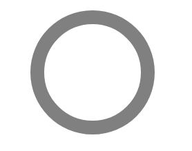
We’ll start by constructing a simple functional component that takes a single prop, radius, and returns an <svg/> element with a nested <circle></circle>.

-- CODE language-jsx keep-markup --
/* ../Gauge.js */

import React from "react";

export const Gauge = ({ radius }) => {
return (
   <svg
     height={radius * 2}
     width={radius * 2}
   >

     <circle
      class="gauge_base"
      cx={radius}
      cy={radius}
      fill="transparent"
      r={radius}
      stroke="gray"
    />

  </svg>
);

}

Several attributes have been set to act as a base for our gauge. The viewport of the SVG can be set simply by doubling the radius that we pass as a prop.

The circle is centered by setting the cx and cy attributes to that same prop. 

-- CODE language-jsx keep-markup --
height={radius * 2} 
width={radius * 2}

Next, we want to render a stroke around the circumference of the circle. However, if we set the radius r attribute of the circle to the same value we pass in, the circle will overflow the bounds of the SVG, so we need to do some math. We’ll need to determine the width of the stroke and the width of the inner radius of the gauge. Let’s set the stroke width to something simple.

-- CODE language-jsx keep-markup --
const strokeWidth = radius * 0.2;

Since the circle will render the width of its stroke, centered, along its circumference, all we need to do is subtract half of the stroke width from the radius we passed as a prop.

-- CODE language-jsx keep-markup --
const innerRadius = radius - ( strokeWidth / 2 );

This will give us a circle that we can use to create our gauge.

svg circle

-- CODE language-jsx keep-markup --
export const Gauge = ({ radius }) => {
  const strokeWidth = radius * 0.2;
 const innerRadius = radius - strokeWidth / 2;
 return (
    <svg height={radius * 2} width={radius * 2}>

       <circle
         class="gauge_base"
        cx={radius}
        cy={radius}
        fill="transparent"
        r={innerRadius}
        stroke="gray"
        strokeWidth={strokeWidth}
      />

   </svg>
);

}

The arc

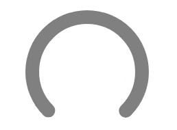
Now that we’ve established the base elements of our SVG, we need to start shaping them into a gauge. First, we’ll need to calculate and define the circumference of our circle. For this example, we’ll set the angle of our arc to 270°. 

Next, limit the stroke of our circle to that arc. We can accomplish this by using the strokeDasharray attribute, which determines the length of dashes and gaps when rendering the stroke of our circle element. By passing the length of our arc and the circumference of the circle, we can trick the strokeDasharray attribute to add a stroke in the form of an arc followed by a gap. This gap will always fill the remainder of the circle. 

Since the SVG will begin its stroke at 0°, which is normally on the right end of the circle, we’ll also need to use a transformation to rotate the circle so the arc is facing upward. This will differ based on the angle of your arc and the direction it should face.

-- CODE language-jsx keep-markup --
const circumference = innerRadius * 2 * Math.PI;

const arc = circumference * (270 / 360);

const dashArray = `${arc} ${circumference}`;

const transform = `rotate(135, ${radius}, ${radius})`;

...


   ...
  strokeDasharray={dashArray}
  transform={transform}

/>

svg gauge

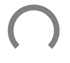
It’s starting to look like a gauge, but we’re not done yet! We can use this shape as the base and set up the filled gauge percent with a prop. To render the percent on top of the base, we’ll simply make a copy of the <circle></circle> element we’ve created and make some slight adjustments. First, we’ll need to pass a percent prop to our component and give the stroke a different color to distinguish against the gray background. 
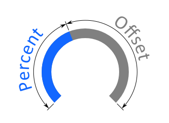
-- CODE language-jsx keep-markup --
export const Gauge = ({ percent = 0, radius }) => {
  ...
  return (
    <svg height="{radius" *="" 2}="" width="{radius"/>

      
        class="gauge_base"
        ...
      />

      
        class="gauge_percent"
        cx={radius}
        cy={radius}
        fill="transparent"
        r={innerRadius}
        stroke="#1267ff"
        strokeDasharray={dashArray}
        strokeWidth={strokeWidth}
        transform={transform}
      />

    
  );

};

Getting offset

Next, we’ll be using the strokeDashoffset attribute to show the progress of our gauge, which changes where the stroke of our circle will begin. If we pass the full length of our arc, it will show no progress. If we pass 0, it will fill the gauge. Knowing this, we can easily find the offset we need by subtracting the percent of the arc that represents progress along our gauge from the length of the arc. We’ll also go ahead and normalize our percent so that values outside of the range 0 - 100 don’t break our component.

svg gauge

-- CODE language-jsx keep-markup --
const percentNormalized = Math.min(Math.max(percent, 0), 100);

const offset = arc - (percentNormalized / 100) * arc;

And just like that, we have a simple gauge component without using any plugins.

For some flair, we’ll round the ends of our gauge using strokeLinecap and add a simple gradient. Unfortunately, there is no standard support for conical gradients, so we’ll be using a simple linear gradient. We can even animate any changes to the percent prop by adding a transition to the dash array attribute.

-- CODE language-jsx keep-markup --
export const Gauge = ({ percent = 0, radius }) => {
  ...
  return (
    <svg ...=""/>

      <defs></defs>

        <lineargradient id="grad" x1="0" y1="0" x2="1" y2="1"></lineargradient>

            <stop offset="15%" stopcolor="#1267ff" stopopacity="1"></stop>

            <stop offset="85%" stopcolor="#98c0ff" stopopacity="1"></stop>


      ...
      
        class="gauge_percent"
        ...
        stroke="url(#grad)"
        strokeLinecap="round"
        style={{
          transition: "stroke-dasharray 0.3s",
        }}
      />

    <svg/>

  );
}

With that, we’ve created a lightweight, custom gauge entirely from scratch, using fewer than 50 lines of code.

-- CODE language-jsx keep-markup --
/* ../Gauge.js */

import React from "react";

export const Gauge = ({ percent = 0, radius, ...rest }) => {
const strokeWidth = radius * 0.2;
const innerRadius = radius - strokeWidth;
const circumference = innerRadius * 2 * Math.PI;
const arc = circumference * 0.75;
const dashArray = `${arc} ${circumference}`;
const transform = `rotate(135, ${radius}, ${radius})`;
const offset = arc - (percent / 100) * arc;
return (
  <svg height="{radius" *="" 2}="" width="{radius" {...rest}=""/>

    <defs></defs>

      <lineargradient id="grad" x1="0" y1="0" x2="1" y2="1"></lineargradient>

        <stop offset="15%" stopcolor="#1267ff" stopopacity="1"></stop>

        <stop offset="85%" stopcolor="#98c0ff" stopopacity="1"></stop>


      class="gauge_base"
      cx={radius}
      cy={radius}
      fill="transparent"
      r={innerRadius}
      stroke="gray"
      strokeDasharray={dashArray}
      strokeLinecap="round"
      strokeWidth={strokeWidth}
      transform={transform}
    />

    
      class="gauge_percent"
      cx={radius}
      cy={radius}
      fill="transparent"
      r={innerRadius}
      stroke="url(#grad)"
      strokeDasharray={dashArray}
      strokeDashoffset={offset}
      strokeLinecap="round"
      strokeWidth={strokeWidth}
      style={{
        transition: "stroke-dashoffset 0.3s",
      }}
      transform={transform}
    />

 
);

};

Written by
People having a meeting on a glass room.
Join Our Team
We are looking for developers committed to writing the best code and deploying flawless apps in a small team setting.
view careers
Desktop screens shown as slices from a top angle.
Case Studies
It's not only about results, it's also about how we helped our clients get there and achieve their goals.
view case studies
Phone with an app screen on it.
Our Playbook
Our step-by-step process for designing, developing, and maintaining exceptional custom software solutions.
VIEW OUR playbook
FullStack Labs Icon

Let's Talk!

We’d love to learn more about your project.
Engagements start at $75,000.

company name
name
email
phone
Type of project
How did you hear about us?
Thank you! Your submission has been received!
Oops! Something went wrong while submitting the form.