

What is Flutter?
Flutter is a tool that allows developers to build native cross-platform apps with just one programming language and also one codebase. It will not create an app that runs in the browser or something that gets wrapped by native apps. Instead, it creates a native app for both iOS and Android that can be published to the stores later.
The good news is that you can create this app just by using one programming language, rather than using separate ones to build an iOS app or an Android app. That way, you will have just one code base to worry about. Flutter is an SDK (Software Development Kit) that allows you to compile your codebase into native machine code that runs on the platforms mentioned above.
Besides its compilation tools, Flutter acts as a framework by providing a collection of UI building blocks (widgets) like tabs, dropdowns, buttons, etc., some utility functions; and some packages that will get compiled by using the SDK.
Flutter can be compared to React Native. Our CTO, Mike Piccolo, discusses the differences between Flutter and React Native in React Native vs Flutter: A CTO’s Perspective.
What is Dart?
Dart is the programming language that Flutter uses. It is focused on building front-end user interfaces and front-end apps. By using it, you will be able to create either web apps or mobile apps.
It is developed by Google and is a class-based, object-oriented, and strongly typed programming language. Dart’s syntax is very similar to languages like Java or JavaScript, so if you have some experience with those, it will be easy for you to begin using it.
Union means strength
So Flutter and Dart are actually two independent things that work together. Flutter is a framework for Dart, and Dart uses the capabilities of Flutter to build the app. In the end, Flutter working as an SDK will help to build the app.
Even though you’ll only have one code base, if at any specific moment you need to differentiate for the platforms you are building for, Flutter will give you the tools to find the platform you are running on and act accordingly either for iOS or Android.
Widgets
Flutter is built using widgets. If you have spent time in React’s world, you could say that a widget is a component. Essentially, it is a snippet of code with some instructions that will have to be beside other widgets and interact with them.
Let’s take a look:
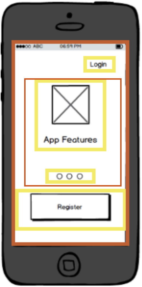
On a simple view like this, you will have a bunch of widgets working together:
- Login button
- Carrousel of features (with two children widgets)
- Register button
- The main widget wrapping the entire app
- Some layout or stylistic widgets
So you will be creating a widget’s tree, with one main root. You might have different views and inside these, you could also have several sections that are composed of a set of widgets.
Another aspect about widgets is the fact that there is not only one type, but different types of widgets that can be divided into the following categories:
- Structural widgets (Card, ElevatedButton, Text)
- Stylistic widgets (ColorScheme)
- Layout widgets (Column, ListView)
Let’s get our hands dirty
First of all, install Flutter and follow all the steps described to set up your env in the following link: https://flutter.dev/docs/get-started/install.
Creating the first app
Once you’re done with that, it's time to create your first Flutter app by using the command line:
flutter create your_app_name
The app’s name must include underscores to separate each word.
cd your_app_name
Go inside your folder’s app.
flutter run
Then execute this command and you should see the default Flutter app running on your device or your emulator.
Caveat: In this app, you will find that by default, Flutter is using the material design system, but you will not be attached to this. Flutter also provides iOS-styled widgets (Cupertino Widgets) and both of them are highly customizable, so you can even have your own styled app.
Project Structure
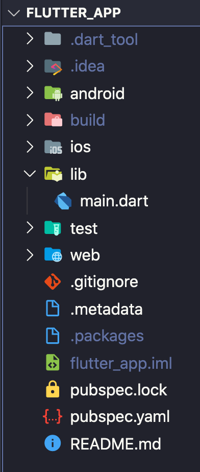
The majority of the files and folders you will find are intended for configuration. Let's take a look at the most important ones:
- Android (folder): Contains a complete Android project, and it will be the one in which your Flutter app will be “merged” when compiling to native code. Inside this folder, you will find important files like build.gradle and AndroidManifex.xml.
- build (folder): Maintains the output of your Flutter app and will be managed by Flutter’s SDK.
- ios (folder): Contains a complete iOS project and will be the one in which your Flutter app will be “merged” when compiling to native code.
- Lib (folder): The folder where you will probably be working the most. It contains all the .dart files to create the Flutter application and contains the main.dart file, which is by default the entry point of the app.
- test (folder): Holds all the automated tests that will check the functionality of the code.
- pubspec.yaml (file): Contains some metadata about the flutter application, but most importantly it will be the palace to manage the project’s dependencies, so this is the place to configure the external packages that will be used by your application.
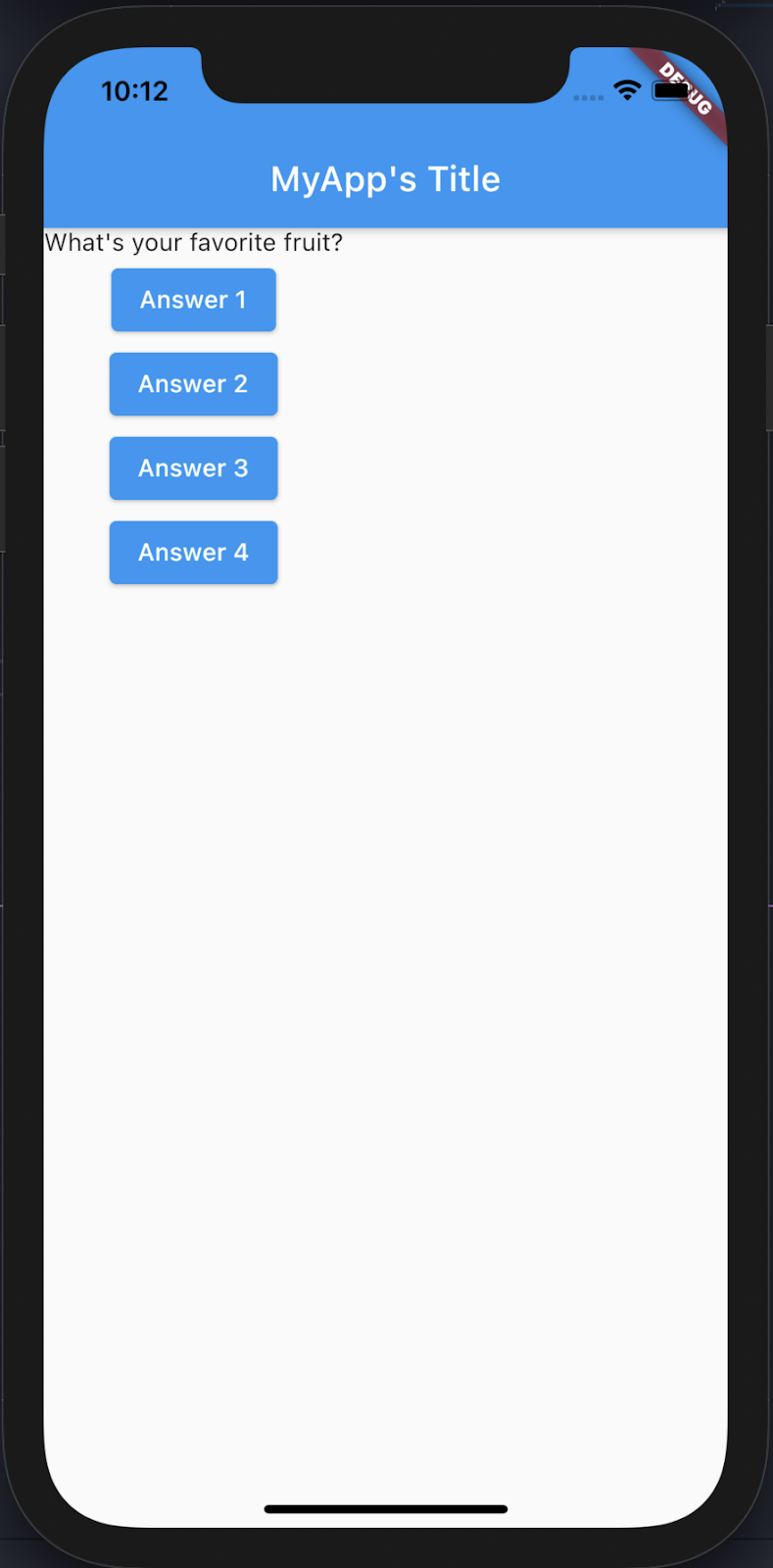
First lines of code
As mentioned earlier, Flutter is made of widgets, which we need to draw something on the screen.
In the code above, we have one main class, MyApp, that is extending a Flutter class (widget) called StatelessWidget.
This class needs to define a build method that must return a widget that at the end will be the element rendered in the screen. For that purpose, we use the MaterialApp class and inside its home property, we make use of another widget, Text, to render a string.
Finally, all this code will run inside the main function (the first function to be called when running the application), which in turn will also run another function runApp to mount its given widget as the root widget and attach it to the screen.
This is a tiny sample, but as you can see we used many widgets above and it can be cumbersome initially, but that’s actually the way Flutter works — the user interface is composed by mixing widgets together.
Base flutter widgets
StatelessWidget
A StatelessWidget does not have any mutable state that it needs to track. Instead, it is composed of other children widgets, and it has a build method for that.
All the new widgets extending the StatelessWidget would not track data over time or trigger re-builds by themselves.
In the above example, we have a new widget UserTitle that only makes use of its final property userName. That property never changes over time and it is finally rendered inside the Text widget.
This component only will be rebuilt when its input data changes.
StatefulWidget
A StatelessWidget provides immutable configuration info and a state object that can change over time and fire rebuilds.
For this kind of widget we would need two classes:
- A widget class: This one will be in charge of maintaining the immutable properties (if they exist) and creating the state object.
- A state class: This class will maintain the properties that would change and it will be also responsible to build the children widgets.
By using the method setState, we can make a change to the state object — in this case, to increase the appsCount property. This change will finally trigger a rebuild in the UI (more specifically on its children) to reflect the new value.
This component will be rebuilt when its input or internal data changes.
Inherited Widgets
Passing data from one widget to another can be cumbersome. Inherited widgets help children widgets to access data from a parent one directly.
In the code above, the class ColorInfo extends the InheritedWidget and it only has a required property child, then we can add any property (or properties) that we actually want to be inherited, in this case, it is colors.
ColorInfo also has two methods:
- The of method: it is in charge to call the InheritedWidget of the exact type, and it will allow children Widgets to access its properties more easily.
- The second method is updateShouldNotify that communicates if a redraw should be executed into the children Widgets when the data changes.
Then we will have a children widget using the inherited widget, for our example, it is WidgetThatUsesTheColorInfo, on its build method, more exactly when using the Text widget the style property uses the ColorInfo widget, and then it calls its of method to access the inherited property colors.
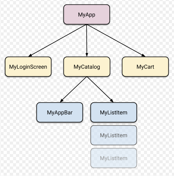
Let’s create something more styled
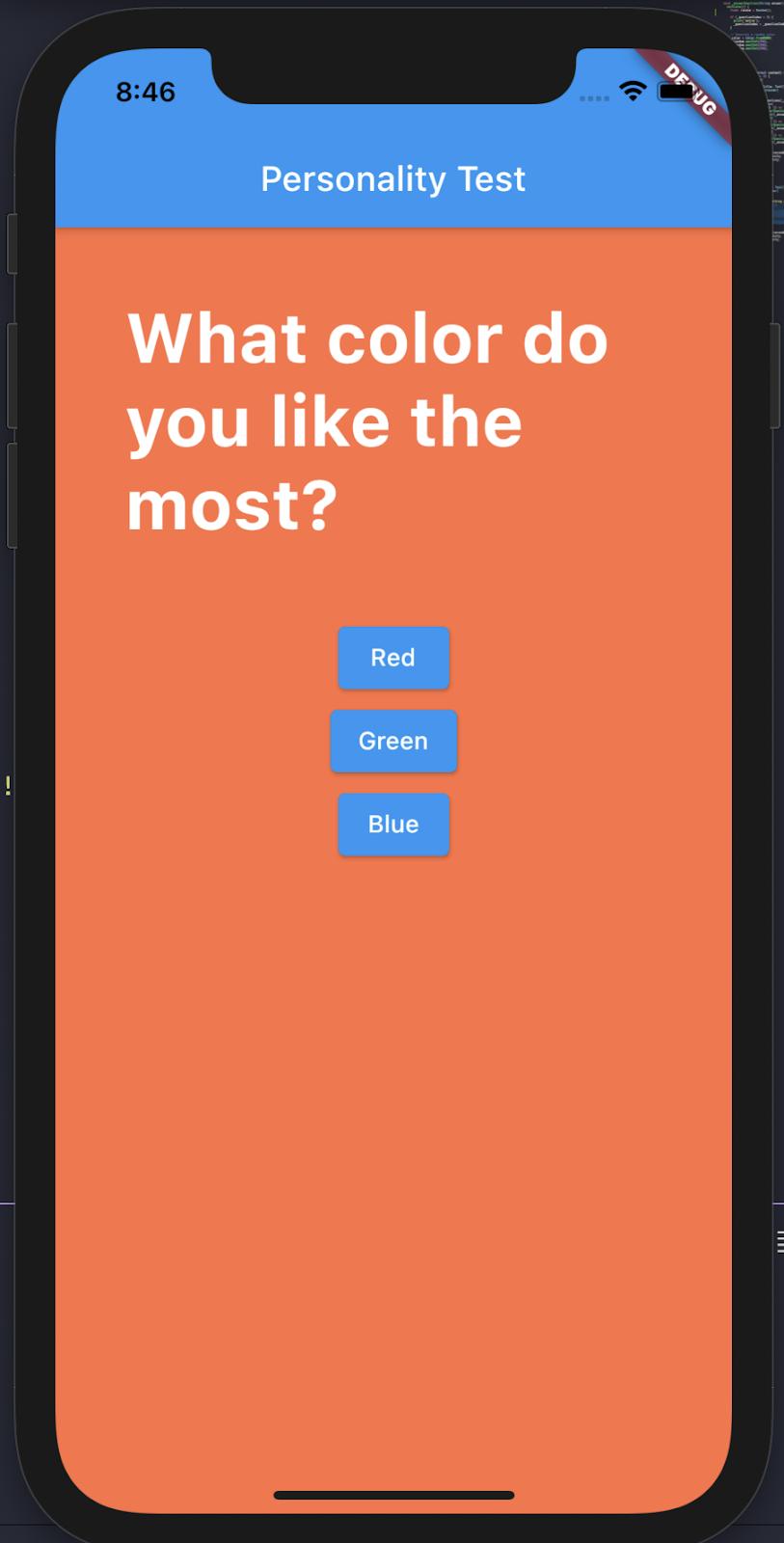
We want to create a little poll, in which we are going to present the user with two questions separately and each time he/she will have two possible answers.
Let’s start with the main widget, a stateful one:
Main.dart
This is our awesome app now:
We have defined a StatefulWidget MyApp and below it, we have its state. With this last one, we implement some rebuilds inside the app each time a button is pressed (by executing the _answerQuestion function ) to present a new question and some new possible answers.
We do this until our questions counter is less than 2. At that point, we change the widget rendered by our root component and now we present a simple widget with a message inside it.
Scaffold:
This is a widget that implements the basic material design visual layout structure.
The most common scenario is to use its AppBar property to add a (yes, you got it)
App bar for the app, followed by its Body property where the app content could be rendered.
Column (layout):
This is a widget that will render its children in a vertical array. It receives a children property where you can list all the internal widgets that a column is going to have.
If the content is larger than the column’s height, it will not add a scroll and conversely will cut the content.
Let’s add some styling for the app’s question. We’ll start by taking it to an isolated file:
First, let’s go and update the main file:
main.dart
Replace:
With:
Now it’s time for the custom file creation:
Question.dart
Now we are using a custom widget inside our app. Let’s take a look at some of its children widgets.
Container: (layout widget)
This widget helps to decorate, positioning, and composing children widgets. With this one, you can add padding, margin, borders, or even background color. In the previous code, we wrapped a Text widget inside the container, and we set the container’s width to expand to the available space and apply some margin (top, right, bottom, left).
This widget only accepts children that must be placed in a property with the same name.
Another type of element with just one children property includes:
- Padding
- Center
- ContainedBox
Text: (UI Widget)
It is a widget to render any string on the screen. It accepts one position value that must be a string, but then it has some named properties to configure the current text.
TextStyle: (Style Widget)
One of the named properties of the Text widget. It will allow applying some styles to the text. In the example above, we used fontSize, color, and fontWeight. Each of these properties has a specific type so its value must respect that.
Using the custom Widget in our root widget
Let’s take a look at a new, more styled version of our root Widget. It will still be a StatefulWidget but with some add-ons:
AnimatedContainer: (layout widget)
This widget is pretty similar to the one that we used on the previous version of this small app, but the special thing about this one is that its properties can be animated.
You can see how we are using the _color variable to change the container color, and that change is going to have an effect anytime the user presses a button and changes the question.
This is one approach but with any gesture or button to enumerate some, you can dynamically change the AnimatedContainer properties and create some cool animations for your app.
So this is our app now. Its design isn’t state-of-the-art, but at least we have some color:
Finally, let's modify those buttons a little bit.
Since we now want to implement some custom buttons, it's a good idea to create a custom widget that holds its shape and style. With that, we have its configuration in just one place, and we can re-use it anywhere.
The above code creates the StatelessWidget CircularButton that receives three positional arguments (onPress, text, value), which will be used to configure the dynamic widget’s properties.
RawMaterialButton: (Ui widget)
This creates a button based on the material Button widgets. You can configure several properties to create your own custom button. With the code above, we created a circular button by setting its shape as CircleBorder and adding a big value for the padding property.
Now we can import this button into our main file and replace the ElevatedButton with our custom button widget.
Besides using the new button component, we have changed the parent layout widget. Now we are making use of Stack, and like its direct children, we are using the Positioned widget. The combination of these two will let us position some elements in an “absolute” way.
Stack: (layout widget)
Unlike column, row, or other container-based widgets, Stack will allow the creation of a view with overlapping widgets. It will accept a list of children widgets to define its size, but you can easily override that behavior and configure it to expand and take the full space of its parent container.
By default, all widgets will be positioned at the Stack’s topStart corner.
Positioned: (layout widget)
A widget that controls where a child of a Stack is positioned.
With the use of its position properties (top, right, bottom, left), we can position its children relative to the Stack Widget.
With the above changes now our app looks like this:
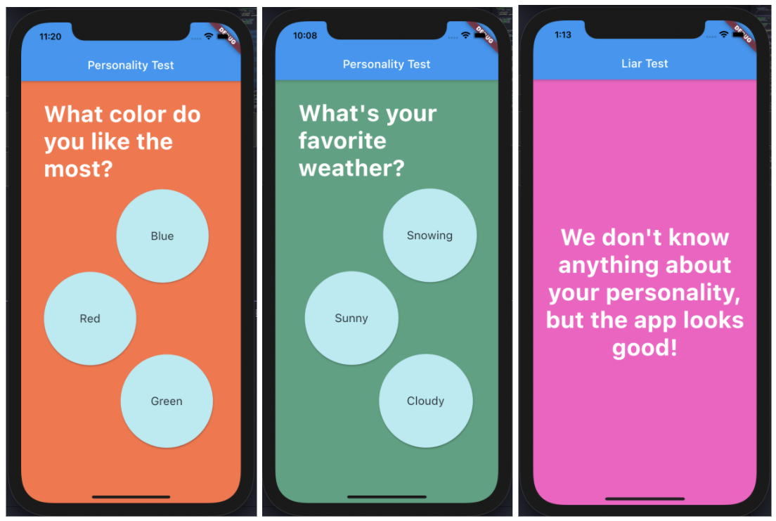
As you can see, the composition is all inside Flutter. We are constantly nesting widgets. Flutter comes with a long, long, long list of widgets that you can use and mix to create your custom ones. In this article, we tackle only some of the most basic ones.
This is only one small piece of Flutter. The path is long and there are plenty of topics to learn about Flutter:
- Theming
- State Management (Providers)
- Adaptive Widgets (depending on OS widgets)
- Routing
- Forms and user input
- Authentication and HTTP calls
- And many more
Flutter is a growing technology nowadays and is winning an important place in the development world, so go ahead and keep learning about it!
If you’re interested in working with Flutter and helping companies develop their Flutter projects, visit our careers page. Also, if you’re a leader looking to develop your Flutter project but need some expert resources, check out our Flutter Developers page to learn more about our available talent.